The “Inventory Performance Dashboard” provides top level inventory reporting for multi-store operators by quickly identifying high and low food cost based on inventory performance. The “Inventory Performance Dashboard” allows you to expand and collapse levels that drill down from top level (Company/Area), to store level, and down to item level.
Accessing the Inventory Performance Dashboard
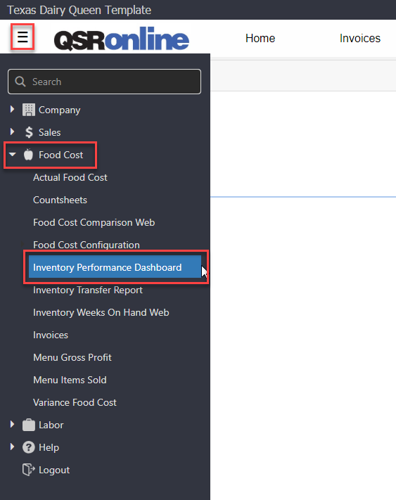
To access the “Inventory Performance Dashboard”, select Menu > Food Cost > Inventory Performance Dashboard.
Inventory Performance Dashboard Report Options

- Select Unit(s): The “Inventory Performance Dashboard” automatically defaults to the user’s highest “Unit Access” level.
- Date Range: Allows you to select a specific “Date Range” to run the dashboard. Please keep in mind that you want to use a “Date/Date Range” that correlates with the selected “Count Type”.
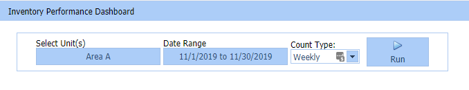
- Count Type: Allows you to select the “Countsheet Type” you want to use to populate the data within the dashboard.
- Monthly
- Weekly
- Daily
- Show/Hide Bar Graph: Allows you to “Show/Hide” the “Bar Graph”.
- Export Microsoft Excel 2003 – 2007 (xls): Exports the report into an “XLSX” file format.
- Export to CSV: Exports the report into a “CSV” file format.
- Save Report Configuration: Saves your “Custom Report Layout” and “Thresholds”. Each time you login, the “Inventory Performance Dashboard” will reflect your saved layout.
- Set color coding: Allows you to select a column and set positive and negative thresholds. Anything above the negative threshold will be color-coded red, and anything below the positive threshold will be color-coded green.
- Column Chooser: Allows you to “Add/Remove” columns from the grid by selecting the “Column Header” and dragging the columns from/to the “Column Chooser”.
- Column Headers: You can sort the data within a specific column clicking on the “Column Header” to sort lowest to highest or highest to lowest.
- Sort Ascending
- Sort Descending
- Clear Sorting
- Search: Allows you to filter the data by column using specific keywords and/or parameters.
-
- Equals
- Less than
- Greater than
- Less than or equal to
- Greater than or equal to
- Between
- Reset
-
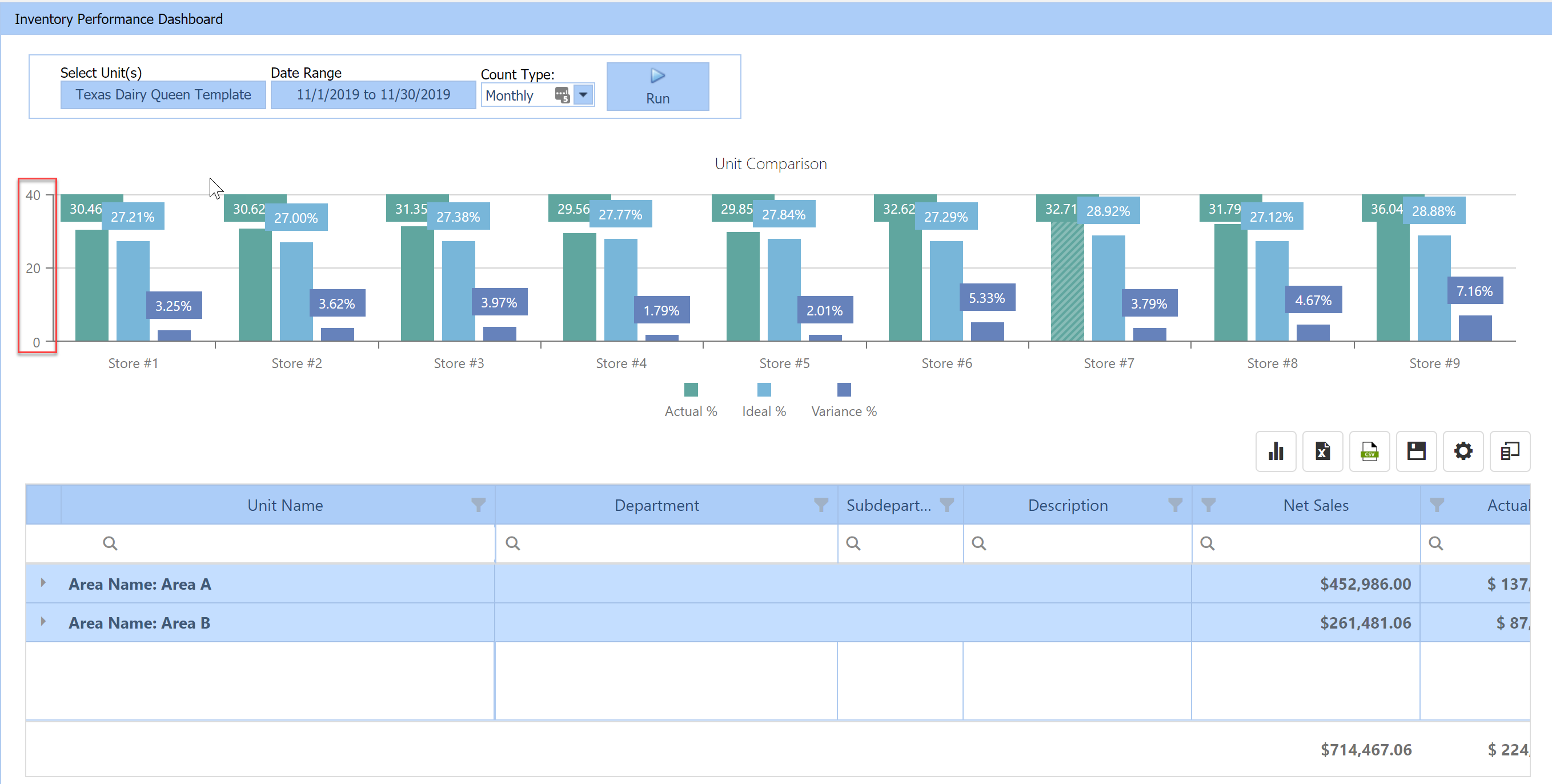
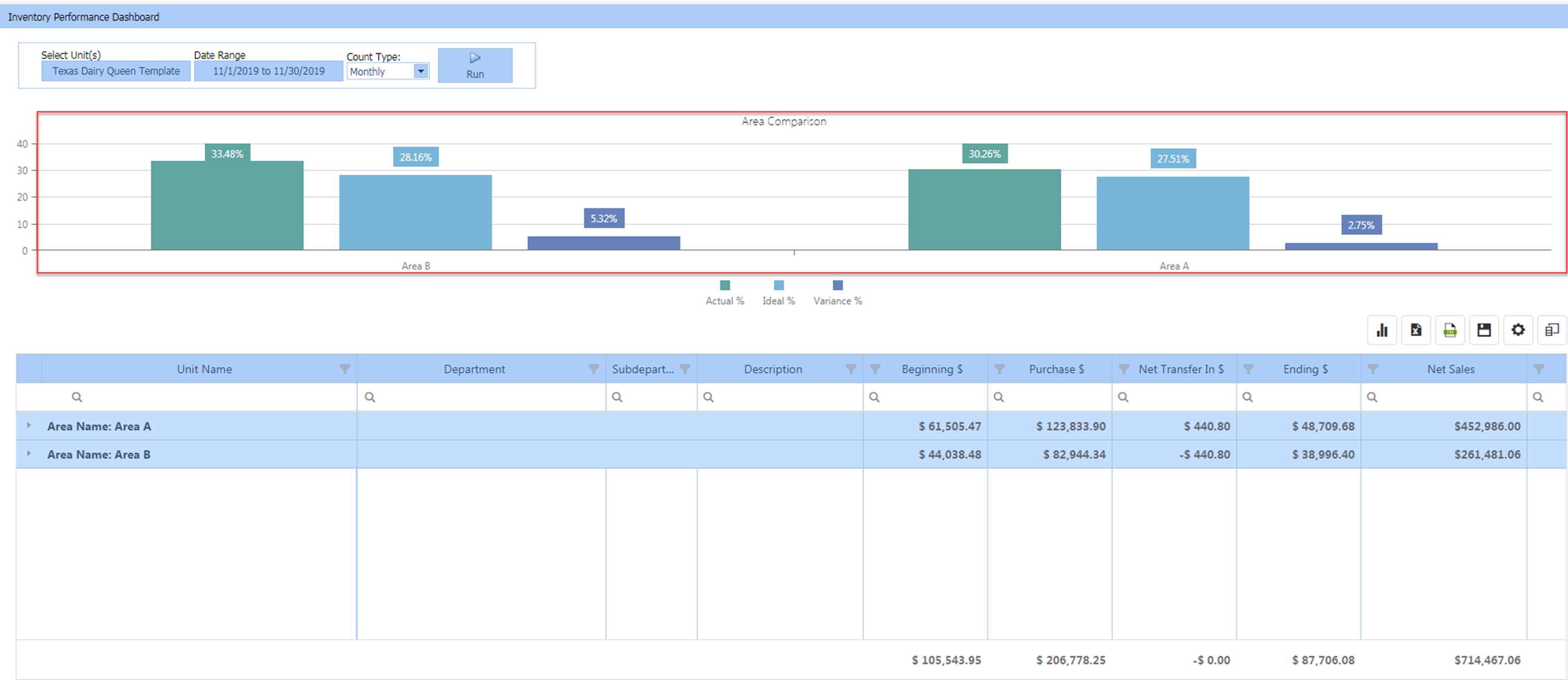
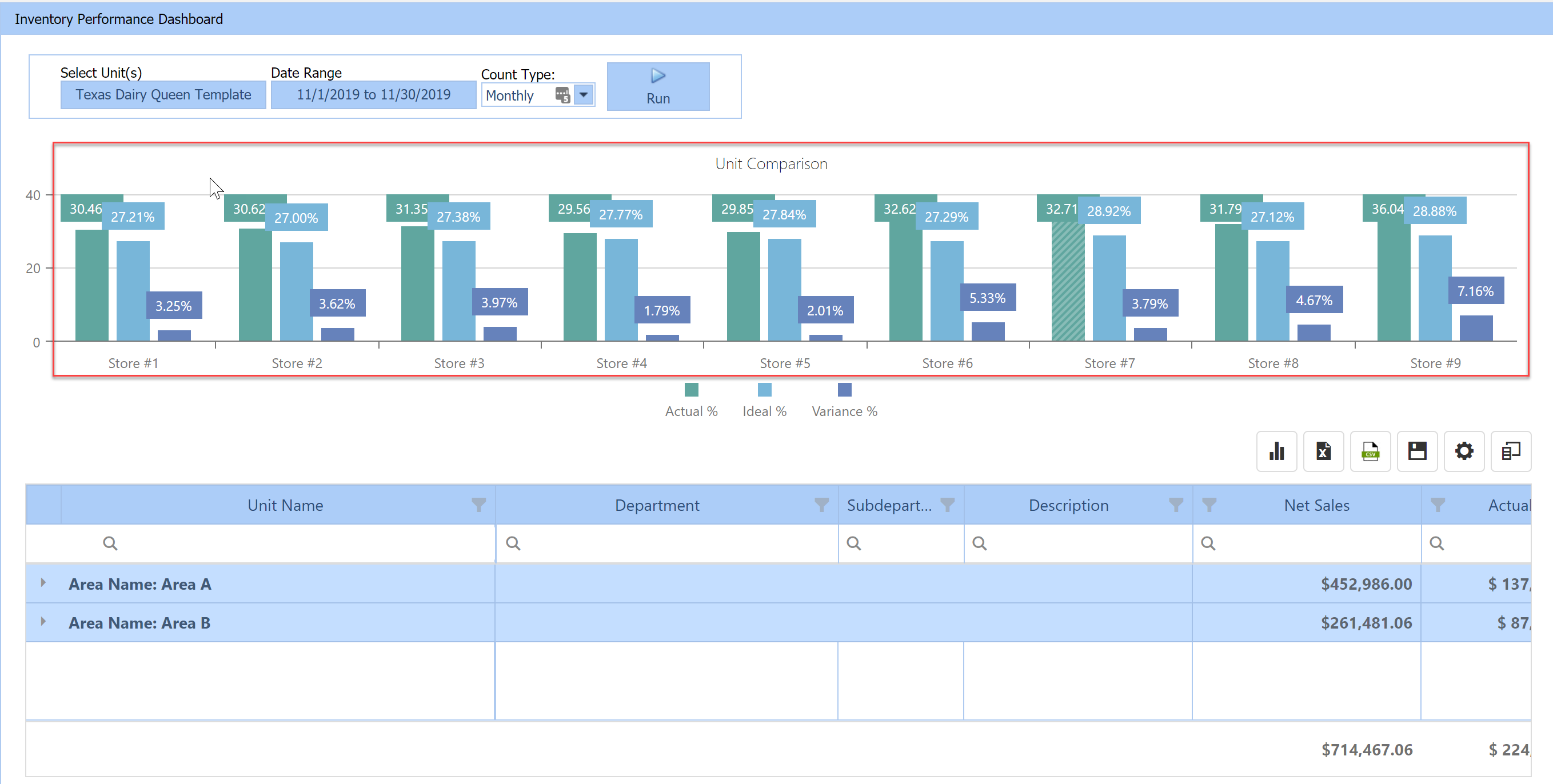
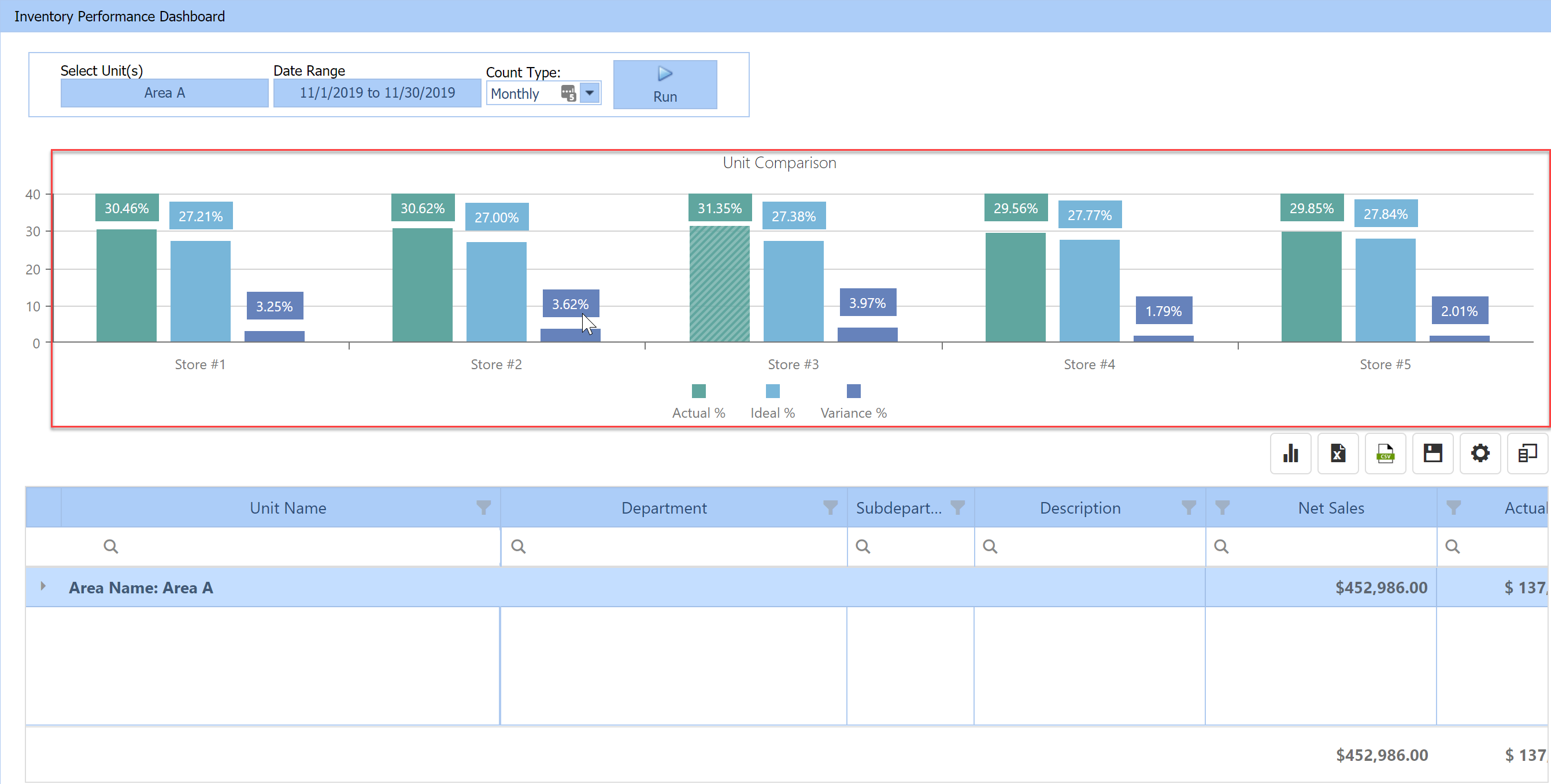
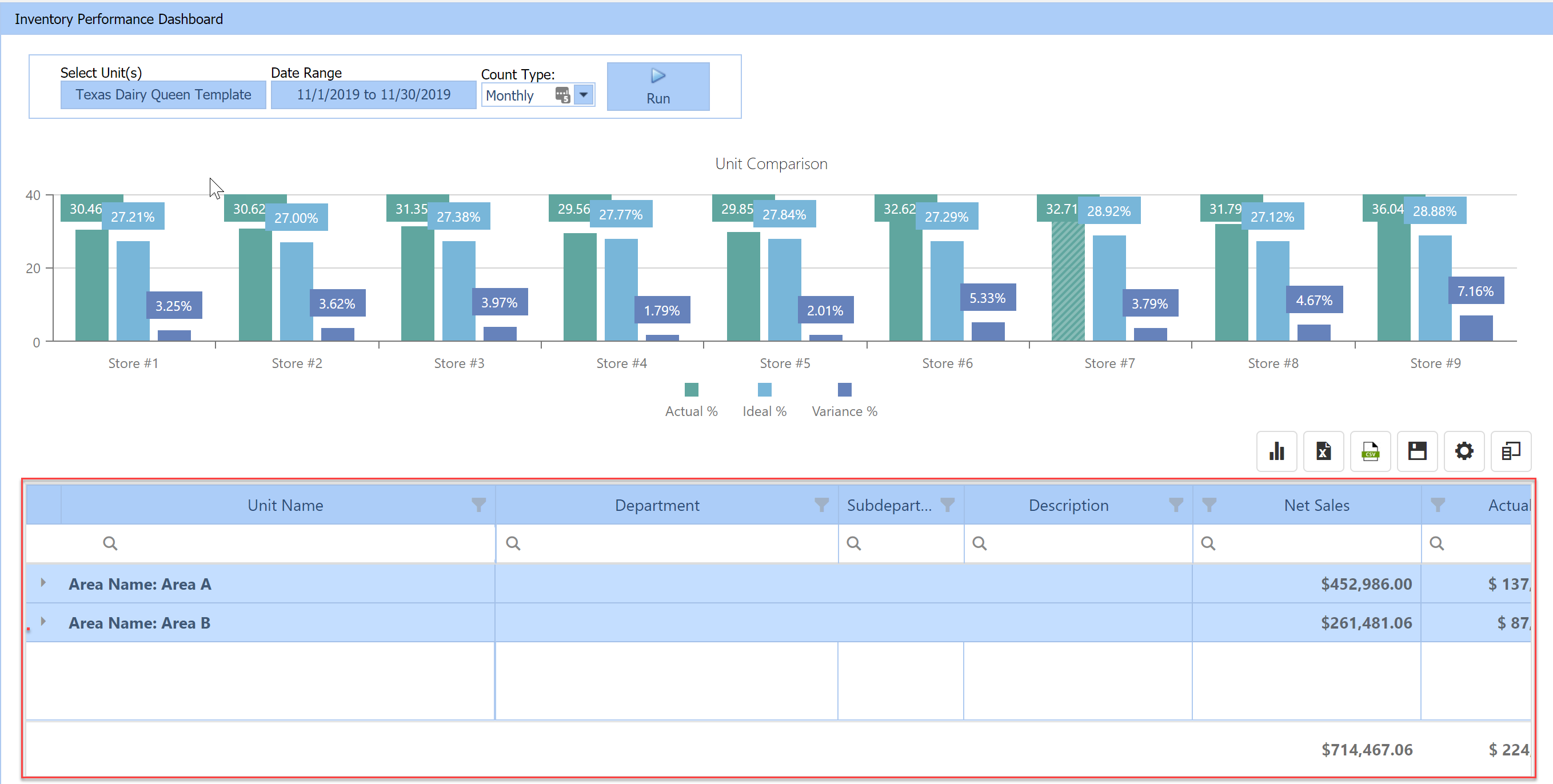
Bar Graph Comparison
The Bar Graph provides you with Actual, Ideal, and Variance Food Cost percentages for an Area or Unit level, depending on the number of units within the company.
The numbers to the left of the Bar Graph display food cost percentages.
The Bar Graph will display an Area Comparison if there is more than 1 area and 10 units within the company when viewing at Company level.
The Bar Graph will display a Unit Comparison if there is less than 10 units within a company when viewing at the Company level.
The Bar Graph will display a Unit Comparison when viewing at an Area level.
Customizing the Inventory Performance Dashboard
You can customize which columns display within the Data Table by simply dragging them to/from the “Column Chooser” to remove/add.
After you have customized which columns to display within the “Data Table”, you can rearrange the columns by dragging them within the Data Table.
Once you have set the columns you want to display within the “Data Table”, you can now set the color coding. Setting the color coding gives you the ability to select a column and set positive and negative thresholds. Anything above the negative threshold will be color-coded in red, and anything below the positive threshold will be color-coded in green.
After you have customized the Inventory Performance Dashboard to your liking, select “Save Configuration” to save your custom report layout and thresholds. Each time you login, the Inventory Dashboard will reflect your saved layout. The “Save Configuration” is user specific so each user can save their own custom report layout and thresholds that are only viewable to them.
Running the Inventory Performance Dashboard
To run the Inventory Performance Dashboard, select your Unit(s), “Date Range”, and “Count Type”, then select “Run”.
(Please keep in mind that you want to use a date/date range that correlates with the selected Count Type.)
The Bar Graph will display by an Area Comparison if there is more than 1 area and 10 units within the company when viewing at the Company level.
If there are least than 10 units within the company the Bar Graph will display a Unit Comparison.
The “Data Table” by default will display by “Area Name” when viewing at a “Company and Area levels”.
You can drill down to the Item level by selecting the arrows next to the “Area Name” and Unit Name within the “Data Table”.
Once at the Item level, you can search and filter columns to compare data across your units for specific items and using specific parameters.